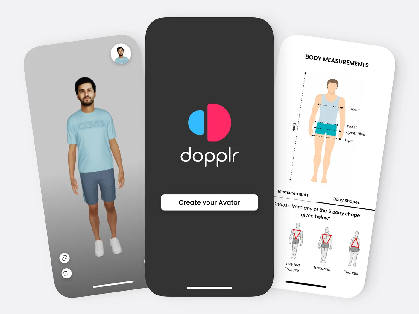
This work reflects my time at Dopplr, a fashion tech company building web-based 3D virtual try-on experiences for ecommerce brands.
The product allowed users to create personalized avatars and preview garments in 3D before purchase. My role focused on designing the core try-on interface, supporting internal workflows, and shaping early marketing surfaces.
This was my first experience designing for 3D interactions on the web, which required thinking beyond traditional UI patterns.
Services
UI/UX Design
User Research
Motion Design
Fashion Technology, E-commerce
Tech Stack
Figma
Protopie
Jitter
The Problem Space
Online fashion shopping struggles with fit, confidence, and returns. Static images and size charts are often not enough for users to understand how a garment will actually look on them.
Dopplr’s goal was to solve this by:
Letting users create a realistic avatar
Allowing garments to be previewed on that avatar
Showing fit and tension visually rather than through text alone
The challenge was making this experience usable and understandable inside a web browser without overwhelming the user.
My Role and Ownership
I worked as a UI and UX designer and stayed close to the product as it evolved. I was designing screens, but I was also spending time with engineers and 3D artists to understand what was technically realistic.
Some days I was focused on the try-on experience itself. Other days I was designing internal tools, prototyping interactions, or working on early marketing pages. The work was not neatly separated, and that overlap helped me make better decisions.
Designing the Try-On Interface
The avatar had to be the center of the experience. Early layouts experimented with dense side panels and visible controls, but they pulled attention away from the garment.
Over time, the interface became quieter. Controls moved outward, the avatar stayed central, and interactions became more discoverable through movement rather than labels.
One of the harder problems was visualizing fit. The product used a tension heat map to show where a garment was tight or loose. Getting this right took several iterations. The colors had to be readable across different skin tones, and the overlay could not overpower the garment itself. It also needed to be optional. When left on by default, it distracted more than it helped.
Prototyping What Could Not Be Explained in Static Screens
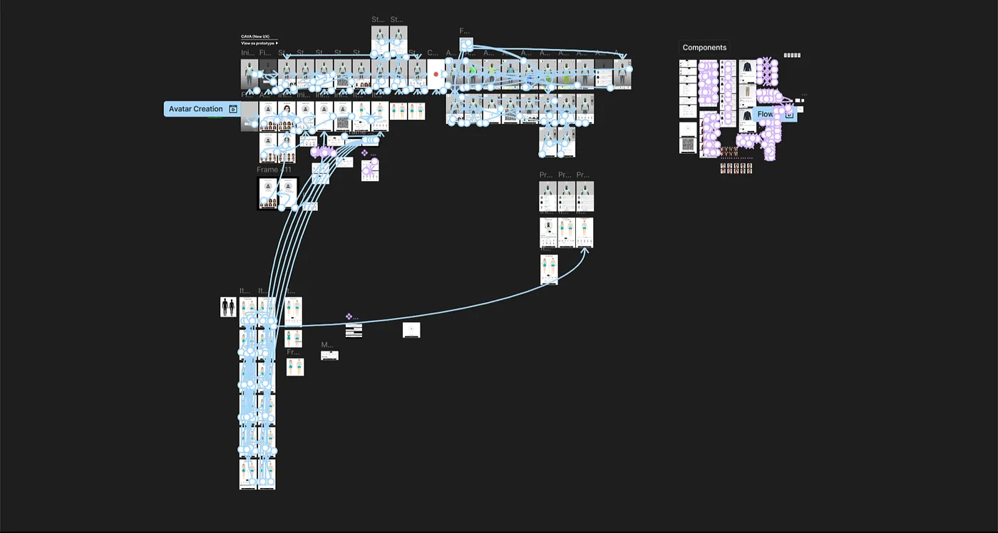
I used Figma for layout and structure, but it broke down once interactions became complex.
I started using Protopie to prototype avatar rotation, zoom, and overlay toggles. These prototypes were not about polish. They were about answering questions quickly. Does this interaction feel natural? Is the response time acceptable? Does this control belong here?
Sharing these prototypes with engineers helped align expectations early and prevented a lot of back and forth later.
Motion as Feedback, Not Decoration
3D assets take time to load. That is unavoidable.
Instead of hiding this, I leaned into motion as a way to communicate what was happening. I designed animated loading states using Jitter that reflected the product’s tone without feeling distracting. The goal was simple. Let users know something is happening and avoid the feeling that the interface is stuck.
This approach carried into smaller interactions as well. Subtle motion helped clarify state changes and made the experience feel more responsive overall.
Designing for Internal Teams
Not all of the work was customer facing.
I also designed internal tools used by designers and 3D teams to review garments and avatars. These screens did not need branding or polish. They needed speed, clarity, and minimal friction. Designing these tools forced me to think differently about priorities and trade-offs, especially since these were used daily.
Marketing the Product
As the product took shape, Dopplr needed a marketing website to explain what it was building.
Designing this site was about translation. The challenge was turning a complex 3D experience into something that made sense within a few scrolls. Visuals did most of the work. Copy stayed minimal. The layout focused on showing rather than telling.
This was also my first time thinking seriously about how product design choices show up in marketing. What we built directly influenced how we could explain it.
What This Taught Me
This work changed how I think about interfaces.
Designing for 3D made me more comfortable with ambiguity and iteration. It also reinforced the value of prototyping at the right level of fidelity and using motion intentionally rather than as an afterthought.
Most importantly, it pushed me to collaborate more closely with technical teams and design within real constraints, not idealized ones.
©2026 – Made by Piyush
5:46 PM


